Project Type:
Beauty
Team
Mario | Christina | Chris
Location:
Africa - UK
Kiese came to us with a vision and a rough logo. They knew who they were and who they were building for. What they needed was a brand that could carry that story properly. Something that honoured their African heritage and tribal roots while feeling clean, minimal and credible enough to sit alongside the best in the skincare space.
Behind the brand
Kiese is an organic skincare company built around one clear purpose. To create products for people with melanin rich skin. From skin and hair lotions to lip balms, everything they make is rooted in African heritage and backed by science. The tribal influence runs through everything, not as decoration but as a genuine part of who they are.


Project Details
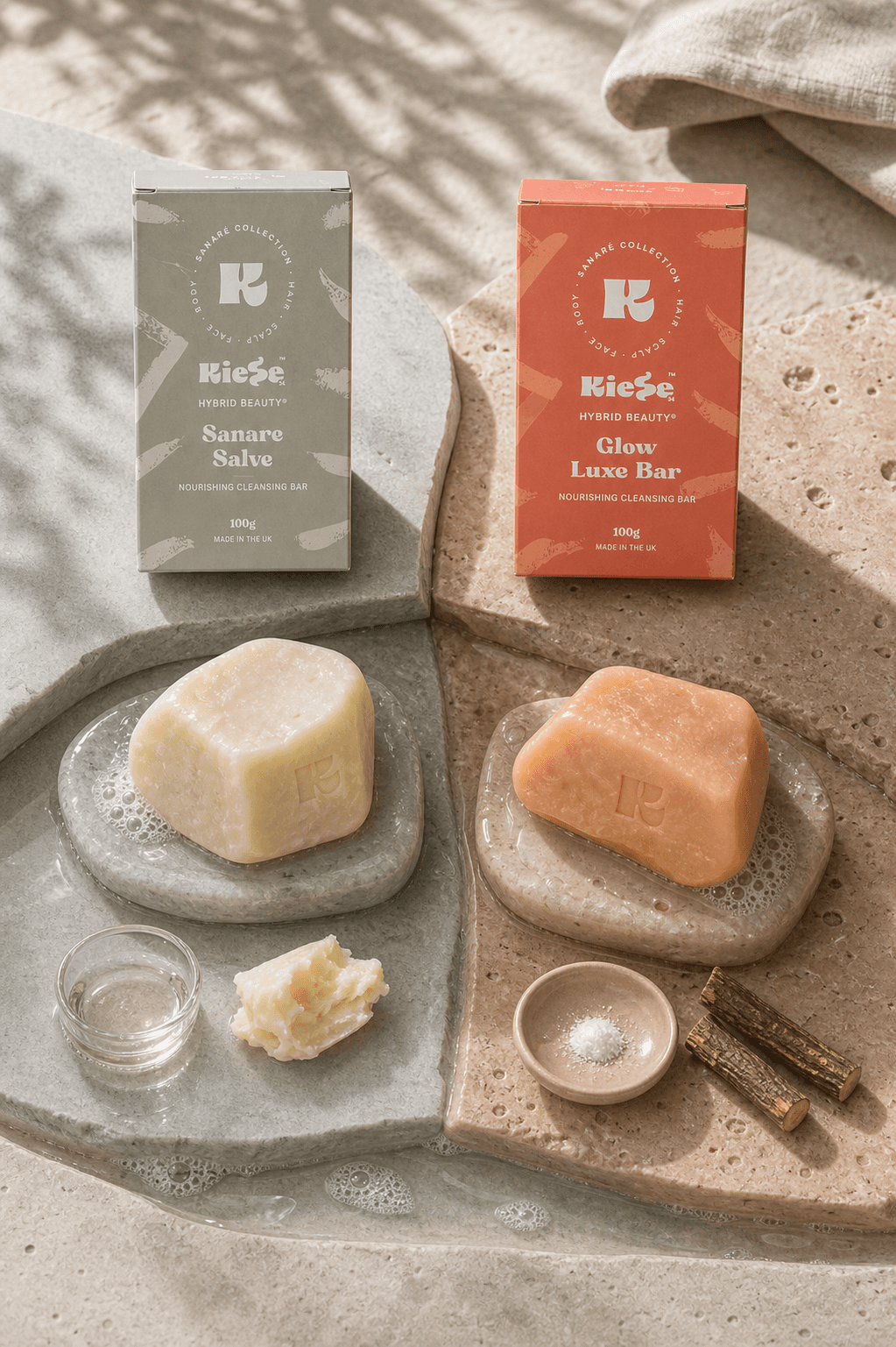
We started by refining their existing logo, giving it the finish it needed without losing what made it theirs. From there we built out a full brand kit covering colour, typography and visual assets. We then developed a brand book that pulled everything together, alongside a tone of voice, a defined ICP and USP, a messaging framework and an overall art direction that gave the whole brand a single, confident point of view. They came to us with an idea. They left with a brand.


Project Outcome
A full brand identity for a skincare company that knows exactly who it is and who it serves. Tribal heritage, clean aesthetics and science backed credibility, all living in one cohesive brand.